From Chaos to Clarity: The business value of visual hierarchy in complex interfaces

Elsje van de Kraats
Visual hierarchy is the organization of content and interface elements in a way that guides the user's attention. By strategically using contrast, color, size, position, and whitespace, you visually prioritize what truly matters. You're not just communicating through text or buttons — you're also communicating through the way information is presented.
In enterprise software, speed is often key. A service agent needs to understand what’s wrong within seconds. A manager must instantly grasp the KPIs. A well-designed visual hierarchy minimizes cognitive effort. If buttons or warnings visually blend in with neutral base elements in your design, something is bound to go wrong sooner or later. Visual hierarchy helps to highlight action items, error messages, or critical decisions. And the faster someone understands how to ‘read’ your interface, the less training or onboarding is required. That’s incredibly valuable in an IT environment with many users or frequent releases.
“Design without hierarchy is like content without context.”
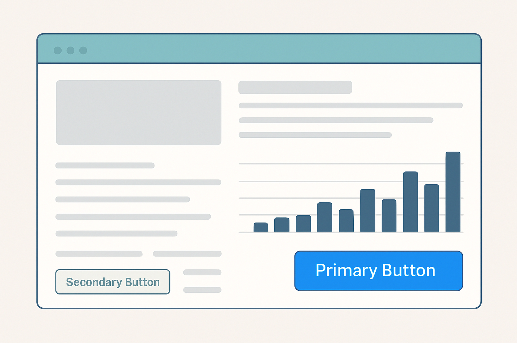
A strong visual hierarchy starts with typography. By clearly differentiating between headings, subheadings, and body text, you immediately create structure. Use bold or larger fonts to highlight key information — but do so consistently to avoid confusion. Stick to two or three font sizes to maintain a calm, consistent look that contributes to clarity.
Color is a powerful tool for creating emphasis, but it requires a thoughtful approach. Avoid using an overload of colors — a rainbow palette quickly leads to visual clutter. When choosing colors, pay attention to accessibility (WCAG guidelines): sufficient contrast between text and background is essential for readability. Additionally, use grayscale tones to visually push supporting or less important elements to the background.
The placement of elements within an interface largely determines how users read and navigate the screen. Ideally, place important information in the top left or center of the screen — right where users’ eyes naturally go first (following the F-shaped reading pattern). Make smart use of whitespace: it helps users distinguish visual groups and prevents the screen from feeling overcrowded.
Buttons and interactive elements need to stand out visually, especially when they trigger important actions. Primary buttons should have a prominent style that grabs attention. For secondary or risk-prone actions, such as “delete,” opt for a subtler color or a less visually dominant appearance. This helps users make the right decisions quickly and reduces the chance of mistakes.
Example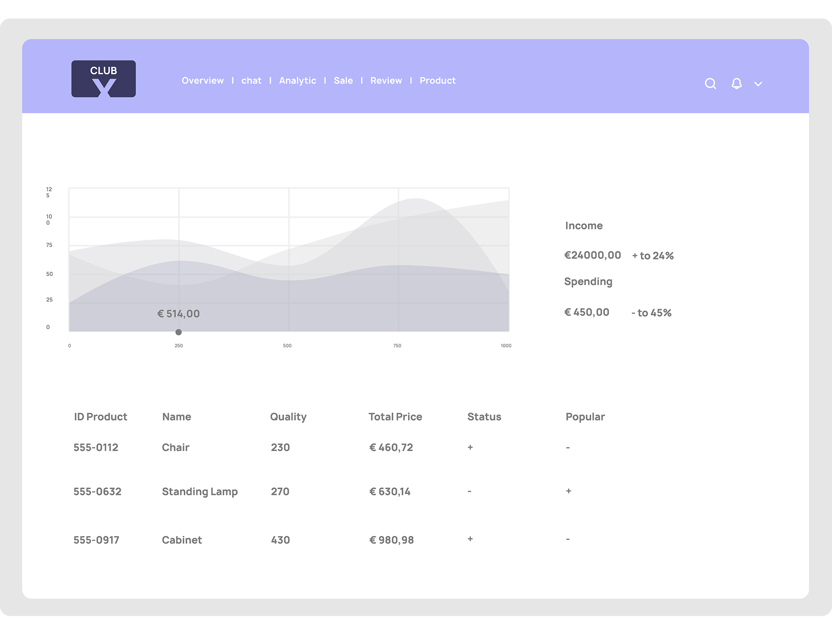
Dashboard for Club X without order, overview, and visual hierarchy.
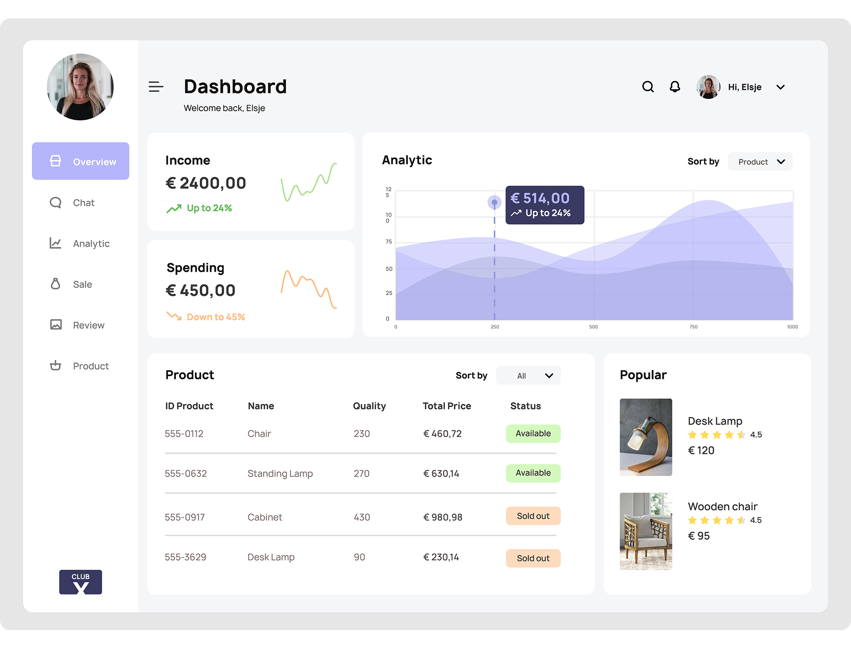
Clear and visually responsible dashboard for Club X with visual hierarchy.
Visual hierarchy is not an aesthetic luxury, but a functional necessity in business software. It makes the difference between a confusing tool and an interface that users understand, trust, and appreciate.
Are you curious about the state of your current interfaces, visual hierarchy, or UX/UI design in general, or are you working on a redesign and want someone to review the graphic aspect?
Feel free to get in touch – Our team is happy to assist you.


Sign up for our newsletter and receive the latest news, inspiring case studies, and innovative developments straight to your inbox.